This is an opinion piece. In our view, AI assistants are changing how people find a business and compare offers, but at the moment of decision they still want to see a button, a price and a contact where they expect them. When it is time to call, book or buy, a predictable button and a short form work better than a conversation with a chat window. A chat on a website is good at specific jobs: helping someone choose a service, answering frequent questions, telling them the status of an order or appointment. As the main navigation, or as the only way to get in touch, it usually gets in the way. On 09.09.2026 Smashing Magazine published the opposite view, that the best interface is no interface at all, and we summarise it fairly below. After that we look at what Nielsen Norman Group writes about trust, how Jakob Nielsen scored his own predictions on 02.07.2026, and what to change on a website now so that both people and AI assistants can understand it.
What is changing: people ask an assistant first
Some customers now open your website only after ChatGPT, Gemini or Google’s AI Mode has compared three businesses, named a price range and suggested who to call. In his July review Jakob Nielsen admits he did not foresee how quickly this would happen. In his view, a website’s main reader will increasingly be a model acting on a person’s behalf, and he points to Google turning Search into a place where agents work.
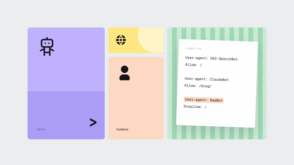
That changes the first job of a website. An assistant must be able to read from the page text what you do, where, for how much and how to book. Google’s guide to AI features (updated 10.12.2025) says no special files or markup are needed for AI Overviews, but important content must be available as text and structured data must match the visible text. How to get an assistant to recommend you specifically is covered in our article GEO 2026: why ChatGPT recommends your competitor. Here we are talking about the next step: what a person sees when they open your site from an assistant’s answer.
In our opinion, a visitor who arrives from an assistant often already knows what they want. They do not explore the site. They look for the place to book and check whether the price matches what the assistant told them.
The opposing view: the best interface is no interface
On 09.09.2026 Smashing Magazine published “The Death Of The Button” by UX practitioner Carrie Webster. Her argument is that the web is moving from clicking to intent. A person states a goal, such as finding a flight, and the system carries out the ten steps that used to be clicked one by one. The interface is generated when it is needed and disappears once the task is done. She suggests measuring success by how quickly the problem gets solved, not by time in the app or page views. She puts the core idea briefly: “The best design is no design.”
We agree with a good part of this. For routine tasks, where people know what they want and a mistake costs little, an intent-based interface is more convenient than a form with ten dropdowns. The author also draws limits herself. In her view routine steps can be automated, but before a payment, publishing something or changing privacy settings the person must explicitly confirm. The system should say how it understood the request so the person can correct it, and there should be a visible way to undo.
This is where we see it differently. For a small business almost every action on its website falls into that high-stakes group: booking a dentist, requesting a quote, placing an order. That is exactly where people need to see what they are agreeing to, and that is exactly where the button stays. We expect fewer steps before the button, because an assistant will help with the choice, and the website’s job will be to show clearly where to book.
What researchers say: trust and predictability
In its report “State of UX in 2026” (16.01.2026, by Kate Moran, Raluca Budiu and Sarah Gibbons), Nielsen Norman Group names trust as one of the biggest design problems for AI experiences this year. The authors write that people who have been let down by one AI feature are more cautious about the next one. Trust is rebuilt with the basics: transparency, control, consistency and support when the system fails. The report also notes that AI tools make a decent-looking interface cheap to produce, so the difference comes from how the system behaves and what it says. We see the same thing in new websites that all look alike, as described in AI slop: why new websites all look the same.
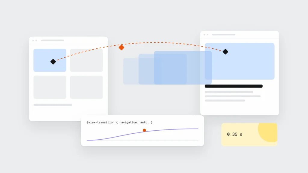
Back on 22.03.2024, in an NN/g article on generative UI, Moran and Gibbons warned about predictability. If an interface changes on every visit, people have to learn it again, and familiar layouts stop helping. They recommend that designers define what must always be shown on screen and what must never be.
On 13.01.2026 Jakob Nielsen predicted that delegating tasks would replace conversational interfaces, that interfaces would no longer be hard-coded and that the era of the generic chatbot was over. In July he scored these predictions himself:
- Delegating to agents: 78%. It works within clearly defined boundaries, but cooperation between different companies’ agents on the open web is still weak.
- Generative UI: 47%. It works for narrow tasks, but conventional software with stable navigation has not gone away. Nielsen recommends a hybrid: a fixed place for frequent actions and generated panels for occasional tasks. In his view, moving an important button on every visit causes frustration and unnecessary cognitive load.
- Chatbots: 62%. A general-purpose chat asks people to explain the job from scratch, and tools built into a specific workflow are overtaking it.
In a Gartner survey (5,728 customers, December 2023, published 09.07.2024), 64% said they would prefer companies not to use AI in customer service, and the main concern was that it becomes harder to reach a person. The data is almost three years old and attitudes may have shifted. Gartner’s advice still applies: in a chat, say clearly when a person will take over, and let that person continue from the same point.
Where a chat on a website helps and where it does not
We do not think a chat on a website is a bad idea. It works when it has one clear job and the ordinary route is always right next to it.
Where a chat helps:
- Choosing. A person describes what they need, and the chat suggests a service or package, shows the price and links to the booking form. This is especially useful if you have 20 treatments or 300 products and the names mean nothing to a customer.
- Frequent questions. Prices, lead times, warranty, paying in instalments, opening hours over the holidays. The answer comes from your own FAQ and price list, with a link to the page where it is written.
- Status questions. Where is my order, when is my appointment, is my quote ready. Here a chat saves a phone call for both you and the customer.
- Out of hours. In the evening a chat can answer a question and log a callback for the next morning.
Where a chat gets in the way:
- As the only way to book. Someone who has already decided does not want a conversation. They want a button and a form with four fields.
- As the main navigation. If services, prices and contacts can only be found by asking, the site becomes unpredictable, and assistants that read the page HTML have nothing to read.
- On top of content on a phone. A chat window that opens by itself and covers half the screen makes it hard to read the price. Chat scripts are also one of the most common causes of poor INP, as covered in Your site loads fast but feels slow.
- When answers are not checked. In February 2024 the Civil Resolution Tribunal of British Columbia (Canada) ruled in Moffatt v. Air Canada that the airline was responsible for what its chatbot wrongly said about discounts, just as it would be for text on a regular page. There has been no such case in Latvia, but the logic is easy to follow: a customer takes a chat answer as your promise. So a chat should answer only from texts you have approved.
Example: a dental clinic in Ogre
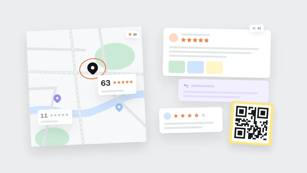
A typical situation: a dental clinic in Ogre with four dentists, a WordPress website, and most new patients coming from Google Maps and search. The header and every treatment page had a “Book” button that opened a four-field form. The website brought in about 64 bookings a month.
The clinic added an AI chat window for bookings and removed the “Book” button so that every booking would go through the chat. The chat asked for name, phone number, treatment and preferred time one question at a time, and sometimes asked again when an answer seemed unclear. On phones the window opened by itself and covered the price table. The next month the website brought in 41 bookings. Phone calls went up a little, but not enough to make up the difference.
What they changed:
- the “Book” button returned to the header and to every treatment, and on phones it sits in the bottom bar next to the phone number;
- the form is again a regular HTML form with four fields (name, phone, treatment from a dropdown and preferred time), with labels and correct input types, so the phone offers to fill in the name and number;
- the chat stayed, but answers only questions about prices, treatments and paying in instalments, takes its answers from the clinic’s price list and FAQ, and ends each answer with a “Book” button;
- the chat does not ask patients to describe their symptoms, because health data is a special category of personal data under GDPR Article 9, and there is no reason to send it to a chat provider;
- the chat window no longer opens by itself, it opens from an icon in the corner;
- the price list and FAQ got structured data that matches the visible text.
Two months later the website was bringing in 72 bookings a month. The chat handles about 180 conversations a month, mostly about implant prices and instalments, and roughly a quarter of them end with a click on “Book”. This is not a scientific test, because bookings also vary with the season. In our view, the chat helped people who were still unsure, and the button helped those who had already decided.
What to change on your website now
Most of this is not new. The difference is that assistants now read your site too, and they trip up in the same places people do: when the button is an image, the price is in a PDF and the form is built entirely from scripts.
- One main button per page. With a verb that names the result (“Book a consultation”, “Get a quote”), in the same place on every page, and within thumb reach on a phone. Nielsen’s warning about moving buttons also applies to sites where the button text and colour change in every section.
- A price or price range in the text. Even “from €60” helps more than “price on request”. An assistant comparing three businesses can only quote what is written.
- Contacts as text. A phone number with a
tel:link, address and opening hours in the HTML text. A map widget or an image does not replace them. - Forms with few fields. Ask only for what you cannot reply without. Each field gets a
<label>, the righttypeandautocomplete, and submitting uses a real<button type="submit">. A phone, a screen reader and a browser agent can all understand a form like this. - A clear structure. Services, prices, contacts and FAQ on their own pages with clear headings. A chat can help people find their way around, but the site has to work without it.
- Structured data. Organization or LocalBusiness, Service and FAQPage that match the visible text. They help search engines and assistants understand what is what, but they do not replace the text on the page.
One technical development: Chrome is testing WebMCP in an origin trial, where a regular HTML form gets toolname and tooldescription attributes so a browser agent can fill it in for the person, while by default the person still presses submit (more in WordPress 7.0 put AI into core).
A 15-minute check
- Button on a phone (2 min). Open one of your service pages on a phone from a Google result. If you cannot see where to book or call within 5 seconds, the button is too low or too faint.
- Form fields (2 min). Count the fields in your enquiry form and decide for each one whether you really cannot reply without it. Company name, address and “How did you hear about us” can often go.
- The page without JavaScript (3 min). In Chrome DevTools press Ctrl+Shift+P, type “Disable JavaScript” and reload. Prices, contacts and the form should still be visible. If the form disappears, AI crawlers that do not run JavaScript may not see it either.
- The assistant’s answer (3 min). Ask ChatGPT or Gemini how much your service costs with you in your town and how to book. Compare the answer with your site. If the price or phone number differs, look for where your site states it unclearly or not at all.
- Structured data (2 min). Run the page URL through Google’s Rich Results Test and check for errors and whether the data matches the page text.
- The chat (3 min). If your site has a chat, ask it the three questions customers ask most often. Every answer should offer a way to book or reach a person, and the price should match your price list.
What to do this week
- Open your site on a phone and check that the “Book” button or phone number is visible without scrolling.
- Remove the enquiry form fields you can reply without.
- Write a price or price range in the text of every service page.
- Check that your form is a regular HTML form with label, type and autocomplete.
- If your site has a chat, make sure every answer offers a way to book and to reach a person.
- Ask ChatGPT or Gemini about your prices and contacts and compare the answer with your site.
Frequently asked questions
Will AI chat replace buttons on websites?
In our view, not in the next few years. AI assistants are changing how people find and compare businesses, but for an enquiry, a purchase or a booking people want a visible button and a short form. In July 2026 Jakob Nielsen concluded that generative interfaces work for narrow tasks while stable navigation has not gone away, and he recommends a fixed place for frequent actions.
When is an AI chat worth adding to a business website?
When you have many services or products and customers need help choosing, when customers keep asking the same questions about prices and lead times, or when many calls are about order status. The chat should answer only from texts you have approved, with a regular button and phone number right next to it.
Does a chat on the website affect SEO?
A chat usually does not improve rankings directly, because its answers are not part of the page HTML that search engines read. A heavy chat script can hurt INP and page speed on phones. Put the information the chat knows into your FAQ and service pages too, so both Google and AI assistants can find it.
How do I make a form understandable to AI assistants and agents?
Build it as a regular HTML form: a form element, a label for each field, the right type and autocomplete, and button type=”submit” for sending. Do not hide the form behind scripts that load only after a click. Chrome is testing WebMCP, where a form gets toolname and tooldescription attributes, but that is still an experiment.
What is generative UI?
Generative UI is an interface that AI builds on the spot for a specific person and task, instead of showing everyone the same layout. Nielsen Norman Group warns that it can become unpredictable, because people have to learn it again each time. In 2026 such interfaces appear more in agent products and prototypes than on business websites.
How many fields does an enquiry form need?
For a service enquiry, 3-4 fields are usually enough: name, phone or email, what you need and a convenient time. Every extra field has to be justified by the fact that you cannot reply without it. The rest can be clarified in the first conversation.
Buttons, forms and chat on a new or existing website
In web design we first lay out in Figma where the main button sits on each page, what goes into the form and where the price is shown, and only then draw the visual style. When we build, forms are regular HTML forms with labels and correct field types, we add structured data and test the site on a phone. A business website is ready in 2-3 weeks. If you already have a chat, it can often stay, with changes to where it opens and what it answers. More on the Web design page. Fill in the form and include your website address: in our reply we will point out where the booking route is too long and which form fields you can drop. Or call +371 25 640 062.
Sources
- Smashing Magazine: Carrie Webster, The Death Of The Button: Why The Best Interface Is No Interface (09.09.2026)
- Nielsen Norman Group: State of UX in 2026: Design Deeper to Differentiate (16.01.2026)
- Nielsen Norman Group: Generative UI and Outcome-Oriented Design (22.03.2024)
- UX Tigers: Jakob Nielsen, 18 Predictions for 2026 (13.01.2026)
- Jakob Nielsen: 2026 AI and UX Predictions: A Mid-Year Reality Check (02.07.2026)
- Gartner: Survey Finds 64% of Customers Would Prefer That Companies Didn’t Use AI for Customer Service (09.07.2024)
- Google Search Central: AI features and your website
- Chrome for Developers: WebMCP Declarative API
- McCarthy Tétrault: Moffatt v. Air Canada, 2024 BCCRT 149
- EUR-Lex: General Data Protection Regulation (EU) 2016/679, Article 9